Choosing the perfect colors for your brand is like picking the right outfit for a big event. It’s all about making the right impression and showing off your unique style. So, how do you find that killer color combo that screams "this is us"? Let’s dive in and have some fun with it!
The Magic of Color Psychology
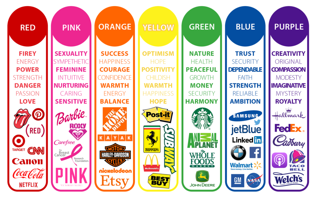
First things first, let’s talk about the magic behind colors. Each color has its own vibe and can make people feel certain ways:
- Red: Think of it as the life of the party – bold, energetic, and a little bit daring.
- Blue: Cool, calm, and collected. Perfect for when you want to build trust and show you mean business.
- Yellow: Sunshine in a color. Happy, friendly, and full of good vibes.
- Green: Fresh and natural, like a peaceful walk in the park. Ideal for eco-friendly and health-focused brands.
- Purple: Fancy and creative. Great for when you want to add a touch of luxury and imagination.
- Orange: Fun and enthusiastic, like a burst of energy. Perfect for youthful and vibrant brands.
- Black: Sleek and powerful, the little black dress of colors. Works for high-end and professional vibes.
- White: Clean, simple, and modern. The go-to for a minimalist look.

I'm sure you have heard that certain colors provoke a certain feeling, behavior or mood. So, how should you take this into consideration when choosing your brand and logo colors?
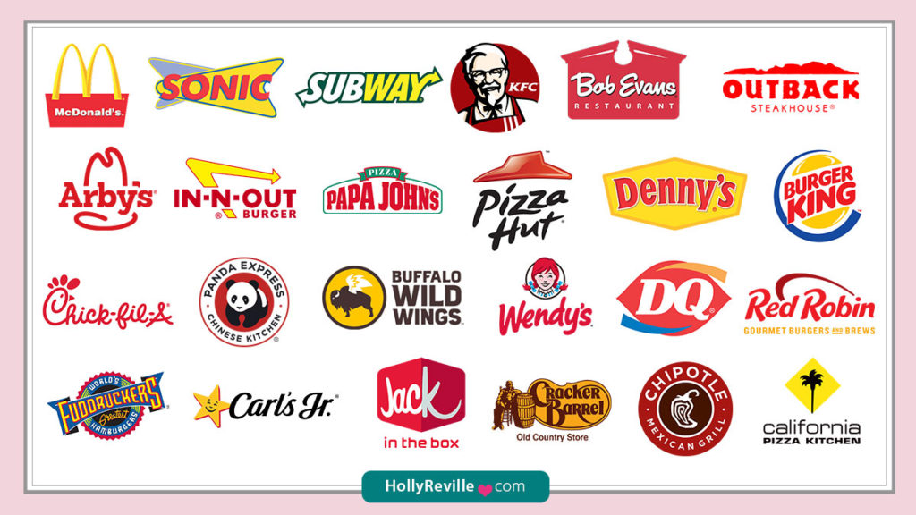
In general, warm colors (red, yellow, orange) tend to stimulate excitement and energy. This is why you will see popular restaurant chains using red or yellow in their logo.

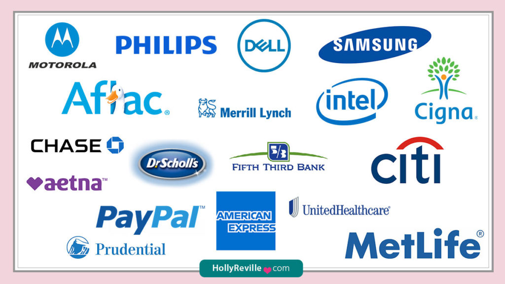
Cool colors (blue, green, purple) are associated with calmness and security. Often times we will see finance, healthcare and technology companies using cooler colors in their logos.

Research reveals that people make a subconscious judgment about an environment or product within 90 seconds of initial viewing. Now, I want you to test this one for yourself, just flip back and forth quickly between these two images above and see how each makes you feel. Did you create a subconscious judgment or perhaps notice an energy shift or change within you just by flipping back and forth?
In Fact, 84.7% of consumers cite color as the primary reason they buy a particular product.
Reflecting Your Brand’s Personality
Your brand’s personality should shine through in your color choices. Ask yourself:
- What feelings do we want to evoke?
- What are our core values?
- Who are we trying to impress?
For instance, if your brand is all about saving the planet, green is your best friend. If you're aiming to attract a young, energetic crowd, splash some orange or yellow around.
Checking Out the Competition
Sneak a peek at what your competitors are doing. Not to copy, but to stand out! If everyone’s using blue, maybe it’s time to play with something different that still feels true to your brand. Standing out in the crowd can make all the difference.
Mixing It Up with a Balanced Palette
A balanced color palette is like a well-rounded meal – it needs a little bit of everything:
- Primary Color: The star of the show.
- Secondary Colors: The supportive sidekicks.
- Accent Colors: The little pops of wow that catch the eye.
For example, start with a cool blue, mix in some light gray and white for balance, and add a dash of orange for those important buttons or highlights.
Testing the Waters
Before you commit, take your colors for a test drive. See how they look on your website, social media, and other materials. Get feedback from your audience – if they love it, you’re on the right track. If not, tweak it until it’s just right.
Conclusion
Choosing the right colors for your brand is like finding your perfect style. It’s all about understanding the vibes, reflecting your true self, and standing out from the crowd. Get ready to dazzle the world with your unique color palette!
Ready to jazz up your brand’s look? Check out our Brand Guidelines Canva Template to make the process smooth and stylish.

